

Your business card is often the first impression you leave with a potential client, customer, or business partner. Despite living in a digital-first world, a well-designed business card remains one of the most powerful offline marketing tools. It’s more than just a piece of paper—it’s a representation of your brand identity, professionalism, and credibility.
However, not all business cards create the right impression. Many businesses make avoidable mistakes that reduce the effectiveness of their cards. In this blog, we’ll highlight the top 5 mistakes to avoid in business card design and share tips to ensure your card communicates the right message.
Why Business Card Design Matters
A business card is more than just contact information—it’s a mini billboard for your brand. Whether you hand it over at a conference, a meeting, or a casual networking event, it creates a lasting memory. A poorly designed card, however, can do more harm than good.
Think about it: would you trust a company with faded colors, unreadable fonts, or cluttered designs? Probably not. That’s why it’s important to understand common mistakes and avoid them in your design process.
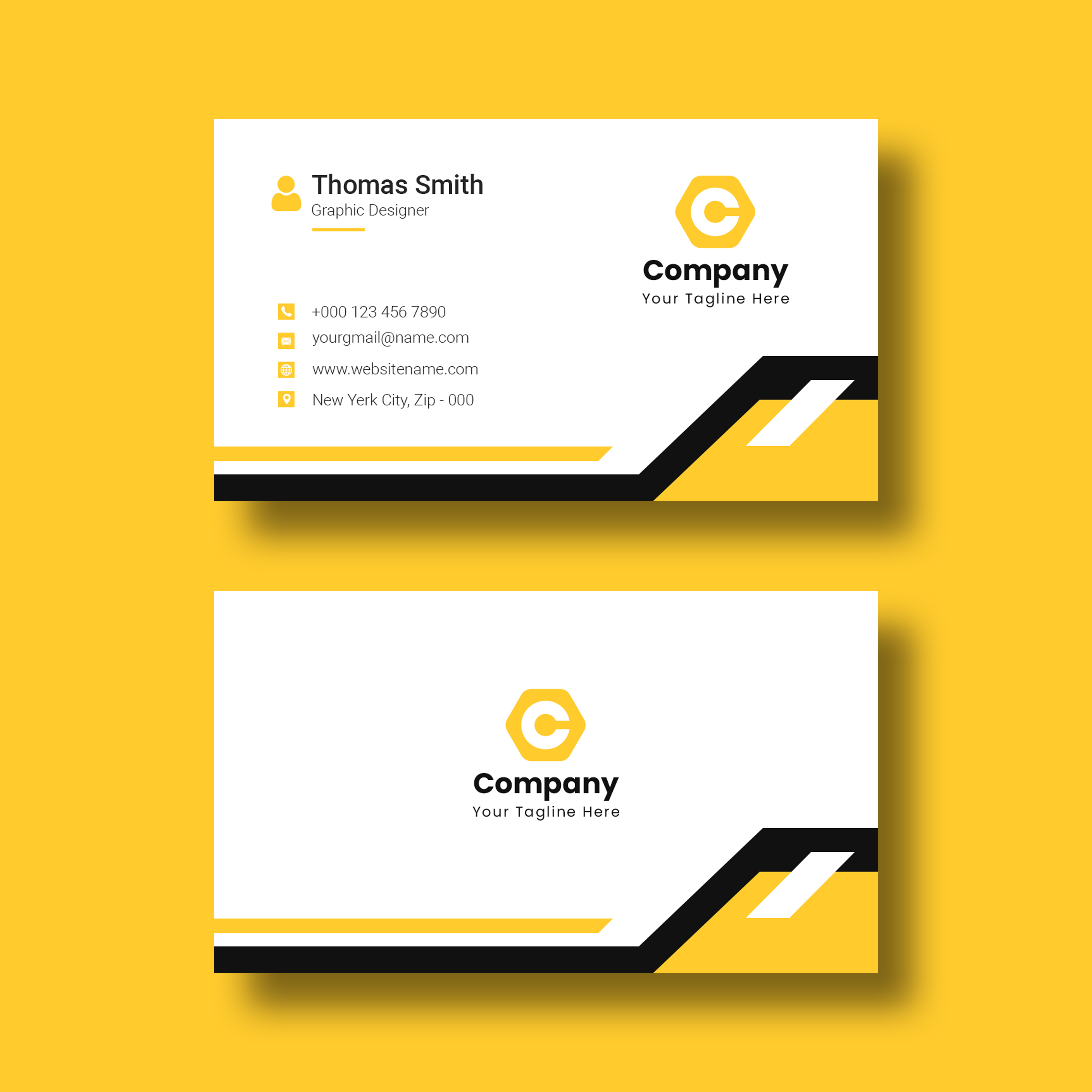
1. Overloading the Card with Too Much Information
One of the biggest mistakes in business card design is trying to fit everything onto a small space. Some businesses make the error of adding:
- Multiple phone numbers
- Fax numbers (which are rarely used today)
- Multiple email addresses
- Long taglines
- Social media handles for every platform
Instead of creating a clean, focused design, this clutter overwhelms the recipient. Remember, your business card should invite curiosity, not overwhelm with unnecessary details.
Pro Tip: Keep only the essentials:
- Name
- Designation
- Phone number
- Email address
- Website link
- Company logo
If you want to showcase more, consider using a QR code that directs users to your portfolio, website, or LinkedIn profile.
2. Ignoring Readability and Font Choices
A common but damaging mistake is using fonts that look attractive but are difficult to read. Fonts that are too small, overly decorative, or lack contrast can make it hard for people to quickly understand your details.
For example:
- White text on a light background reduces legibility.
- Using more than two different fonts makes the card look messy.
Pro Tip: Stick to clean, professional fonts like Helvetica, Roboto, or Garamond. Ensure there’s enough contrast between text and background, and keep font sizes readable.
If you’re unsure about the right style, check out some creative business card ideas for inspiration.
3. Choosing the Wrong Material or Finish
Another design mistake lies in the choice of card material and finish. Even the most beautiful design won’t shine if printed on cheap, flimsy paper. Similarly, the wrong finish can undermine the overall appeal.
- A glossy finish might look modern, but it can make it hard to write on the card.
- A matte finish offers elegance and sophistication, but it may not suit every brand.
Your choice of material and finish should align with your brand personality. For example, a creative agency may opt for bold, glossy cards, while a law firm may prefer a matte, minimalist look.
👉 To help you decide, explore our guide on matte vs. glossy business cards and choose the one that fits your brand image.
4. Poor Use of White Space
Some businesses feel the need to fill every inch of the business card, but this results in cluttered and unattractive designs. White space (or negative space) is essential in design—it allows your key elements to breathe and draws attention to important details.
Without adequate white space, your card looks overcrowded, reducing readability and professionalism.
Pro Tip:
- Maintain balance between text, logos, and design elements.
- Avoid edge-to-edge text—leave margins for clean design.
- Use white space to make your contact details stand out.
5. Not Aligning with Brand Identity
A business card should reflect your brand identity. Many companies make the mistake of using colors, fonts, or layouts that don’t align with their overall branding. This inconsistency weakens brand recognition and confuses clients.
For example:
- A luxury jewelry brand using bright neon colors may send the wrong message.
- A tech company with outdated fonts and dull colors may not appear innovative.
Pro Tip: Use your brand’s existing color palette, fonts, and logo placement. Consistency across all branding materials—website, brochures, business cards—creates a professional and memorable image.
Bonus Mistake: Using Low-Quality Printing Services
Even if your design is perfect, poor printing can ruin everything. Low-resolution logos, blurry text, or uneven cuts can make your business card look unprofessional. Always choose a trusted printing partner that guarantees high-quality results.
For instance, if you are in Delhi NCR, check out professional printing services to ensure your cards look sharp, durable, and premium.
Final Thoughts
A business card is often the first physical interaction someone has with your brand, so getting it right is essential. By avoiding these top 5 mistakes in business card design—overloading information, poor font choices, wrong material, lack of white space, and inconsistent branding—you can create a card that truly represents your business.
Remember, your business card should be:
- Clear and readable
- Professionally aligned with your brand
- Printed on quality material
- Minimalistic yet memorable
With thoughtful design and professional printing, your card will not only share contact details but also leave a powerful, lasting impression.
For all your printing needs, visit PrintifyTech.com today.
“Order custom Glossy Visiting Cards that reflect your brand’s professionalism.”
Pingback: Tips to Make Your Visiting Card Stand Out - Printify Tech Blog
Great point on not overloading a business card with too much information! It’s all about making it easy for people to remember you and reach out when they need to.
I love the emphasis on keeping the design clean and focused. I’ve seen so many business cards with way too much information, which only makes them hard to read. A card should be memorable for the right reasons, not because the person has to sift through unnecessary details.